Simplifying the essence of good UX
How to design products and services that delights
The process of user experience design can get complicated and involved and somewhat confusing. However, the essence of a good user experience is quite simple. This post outlines the three most important elements of a good user experience.
There are of course other foundational elements to user experience design that remains valid, like knowing who your target user is, problem framing etc. However, this post focuses on the user journey - or process flow and key UI elements - assuming you know your user and their specific goals when interacting with your product.

1. Provide context
Imagine, just for a moment, being blindfolded and dropped in the middle of a busy city you’ve never been to before. What do you feel when you open your eyes after the blindfold has been removed?
Most people will be anxious and overwhelmed, not knowing where they are or which direction to take next. That is how new users also often feel when they land on a website or app they’re not familiar with. It can feel so overwhelming that many visitors will simply close the app and go back to one they are familiar with.
One of the most important elements of a good user experience is providing context. It is rather like having access to a map with markers showing you where you are and clear directions of how to get to where you want to be.
Some examples of this include the mini-map in the bottom left corner of Conceptboard which allows you to zoom into one section on the board, while still being able to see where you are in relation to the rest of the contents.

Above you can see a thumbnail of the entire board in the left bottom corner, with the section currently displayed in my view port outlined with a blue border on this thumbnail image.
Thus, if I want to go to the start of the content, I roughly know how much I should move and in which direction.
YouTube, which most people will be familiar with, does it differently, yet, the concept remains the same. All the important information that will tell you where you are in relation to your YouTube subscription are displayed on the first page.

As you can see above, I can immediately see who is logged in, any notifications, and then whether or not there’s new content or live broadcasts for any of my favorite channels. Having this information available at a glance can save me from scrolling searching for new content from the home page.
Another, more common, example of context is the use of dashboards. Dashboards contain only a summary of the most important statistics to give you an overview of the status of any product, process, or organization. It contextualizes the most important elements that will allow you to focus on the most productive area.
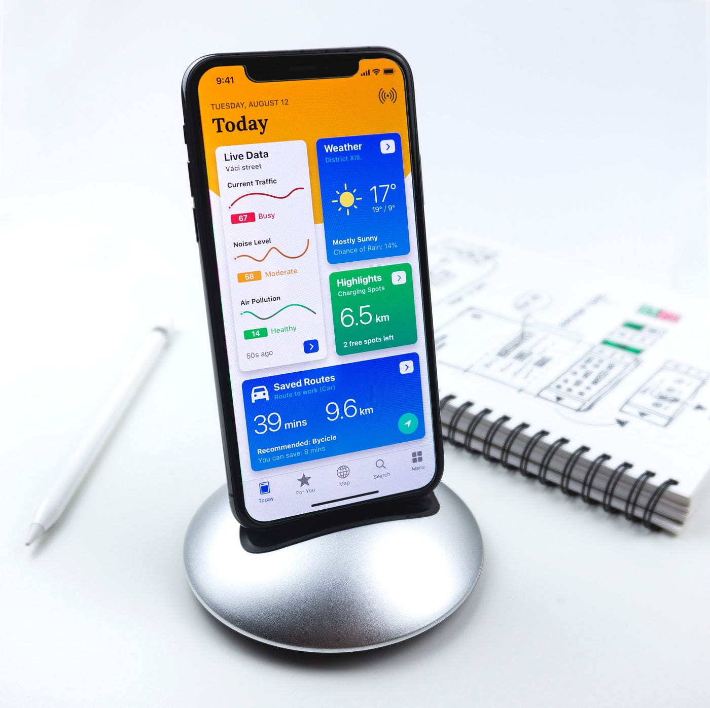
For example, if the dashboard shows that the current traffic is busy, you might decide to take a bicycle, or wait a while before getting into your car.
By providing a birds-eye-view of a larger, more complex product or system, you can easily navigate and make better decisions, which makes you feel more in control. And ultimately, the best user experience is one where you always feel that you’re in control.
2. Make it as efficient as possible
Apple mastered efficiency with its focus on simplicity. It’s easy to add just one more feature or button or step in a process. It’s hard to remove clutter and reduce a workflow to the absolute minimum amount of steps.

Apple managed to reduce the number of buttons on its devices so that it’s close to impossible to press the wrong button or wonder which one to select to get the desired outcome. They also reduced the number of available apps which makes it so much easier to find one you are looking for rather than spend hours filtering through all the available apps on the Google Play Store for example, never quite knowing what you are getting.
Reducing the number of steps, interactions, and options to choose from reduces cognitive load and overwhelm. It makes it easier to get to your desired destination, and it makes it harder to accidentally do anything wrong in the process.
Another good example of efficiency is the famous Amazon one-click checkout where they aim to reduce the human interaction to complete an online purchase to a single click.
A good user experience spends a lot of time on streamlining the processes and steps within a process to be as efficient as possible. It’s about simplicity and clarity. Looking at the map metaphor in the previous point, efficiency is rather like having Google Maps direct you to your destination. It calculates the shortest route based on your preferred mode of transport and clearly guides you throughout your journey.
An efficient user experience is like drawing a map to direct an alien to the nearest coffee shop. You can’t assume anything and can’t communicate using words, as an alien might not understand our language. Rather, communication is visual, highlighting only the most important landmarks on the way and clear directions towards your destination.
Efficiency is about simplicity and speed. How fast and how easily can you get from where you are to where you want to be?
3. Be proactive, not reactive
The third and final element of a good user experience is pre-empting a user’s next step and making it as easy and obvious as possible. It’s rather like the emergency exit pointers in an airplane that lights up when there’s an emergency. You might not see the destination, but you have no doubt as to what the next step is.

A good user experience is one where you don’t have to stop and ask for help while already on your journey. Rather, your questions are pre-empted as they arise and answered before you have to ask for help.
Many user experiences expect that you should learn all the information required for your entire journey before you start. Onboarding requires you to complete a tutorial of features you might never use or need before you have even decided whether this is the app for you. Once completed, your one chance of accessing this information is over and you’re on your own having to figure out how and where things are when you need them.
A good user experience, on the other hand, is one where you get just-in-time information throughout your journey in small increments. It doesn’t tell you everything you might need, it tells you the most important things you have to know in order to successfully complete the next step of your journey.
An excellent example of this concept can be seen from a local air carrier called FlySAFair. A day before your flight you receive an email with a checklist of everything you need to do before your flight.

They send this information just in time for you to have the highest probability of having an easy, smooth flight. If they sent the information too early you might forget. Rather, they send it just you need to check-in.
This is probably the best example of pre-empting the next step in the user experience so I’ll leave it at that. The essence of this element is to think one step ahead of the user and give them all the information they might need in order to just complete that one step.
Putting it all together
When I think of a really good user experience, I think of the IKEA experience.
From the moment you enter an IKEA store you are guided in a one-way direction throughout the store, with shortcuts and openings at strategic places to cater for people looking for something specific. You always know exactly where you are and there’s no chance of getting lost or going in the wrong direction. This frees your active memory to allow you to focus on enjoying the shopping experience, rather than figuring out where you are or where you want to go.
Each section adds context with inspiration corners showing you how to put different elements within the store together. There isn’t just sofa’s, there are sofa’s with scatter cushions, throws, candle’s, side tables, mugs, plants and more. The bedroom area doesn’t just display beds, there are also soft finishes like curtains, bedding and lamps. They show you how to use different products by displaying it throughout the store.

What I love most about the IKEA concept is that it doesn’t expect you to make up your mind before you’ve gone through the entire store. There are notepads and pencils at strategic points for you to make notes as you stroll through each section. Only at the end of the store are you asked to make a final decision by selecting the items you saw in the display area from the warehouse. This means there is time for ideas to develop in your mind, and it also means you don’t have to walk through the entire store with bulky or difficult to carry items.
There is adequate context with a comprehensive store where you know you can literally get everything you need and want to furnish an entire home — all in one place. All you have to do is follow the path laid out in front of you.
The journey is efficient, wasting no effort in walking up and down different aisles searching for something as everything is one-directional, but with shortcuts for the seasoned IKEA’er.
Information is given just-in-time as you need it with strategically placed display corners and information booths. There is also a cafeteria area just when you start to get tired, as if they knew this is where people need to stop for a coffee and local Swedish delicatessens. Everything is designed to give information just one step ahead of where you currently are, making it pro-active.
Putting all these elements together, plus of course the quality and innovative design of the products, make shopping at IKEA a pleasurable experience.
If you need an objective assessment of your product’s user experience, or guidance in how to create a great user experience, book an introductory no-obligation call at https://www.funficient.com/ or sign-up for a month-to-month package.
Originally published on Medium: https://funficient.medium.com/the-essence-of-good-ux-explained-6959b8a5a04e